 FLARE
FLARE
Dashboard
FLARE comes with a ready-made dashboard: a view for each schedule, and one for your zones. It builds itself from your schedules and zones each time it loads, so one you add later appears on its own.
Add it from Settings → Dashboards → Add dashboard: pick FLARE Lighting, then give it a
name and an icon. FLARE’s logo is in the icon picker as flare:logo.
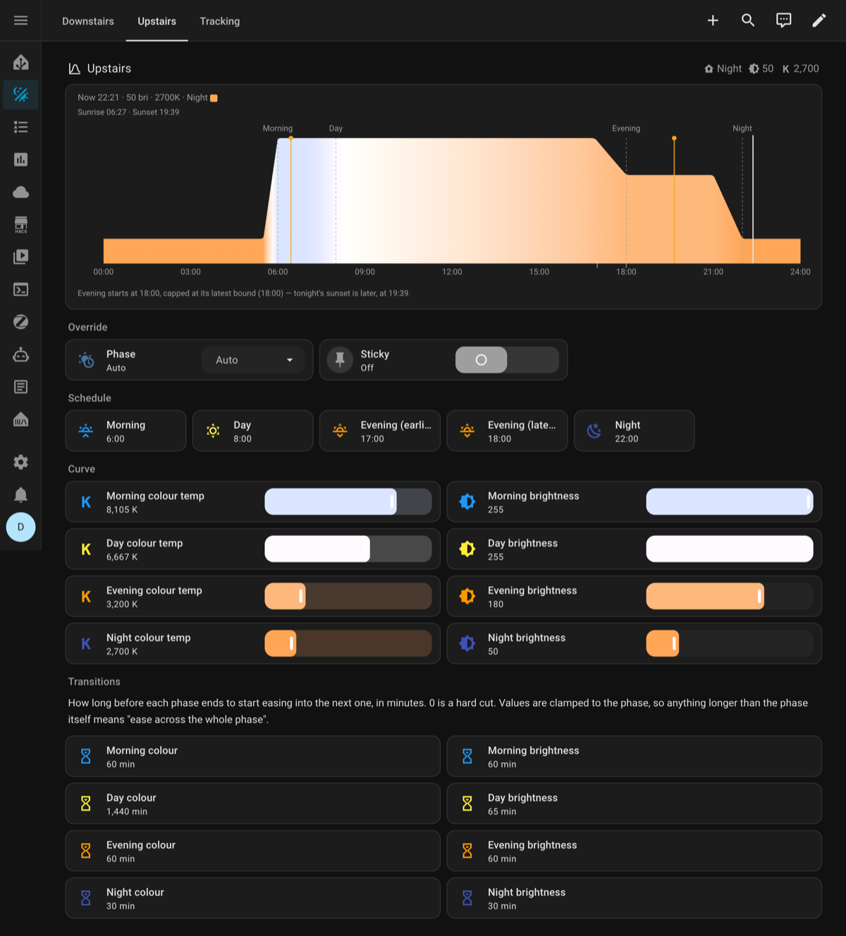
- A schedule’s view shows the day’s curve and every schedule and curve setting.
- Zones starts with All zones: how many lights FLARE is driving across the house, how many something else has taken over, and a Clear button for every zone at once. Below that is each zone, by floor and area, laid out like Home Assistant’s Lights dashboard: its controlled and overridden counts, which lights are overridden, and a Clear button to hand them back. A zone’s name opens its device page. Beside the zones, Activity lists the last 24 hours of what the zones did, coloured by kind - blue when a zone takes its lights, amber when something else overrides one, grey when a zone lets them go - and the buttons at its top show one kind at a time. Selecting an entry opens that zone’s device page. On a narrow screen, Activity is a separate tab.
Adding the views to another dashboard
The same views can go in a dashboard of your own. Open it, then Edit dashboard → the three-dot menu → Raw configuration editor, and add:
views:
  - title: Lighting
    strategy:
      type: custom:flare-schedule
  - title: Zones
    strategy:
      type: custom:flare-zone
Like the ready-made dashboard, both views find their own entities each time they load.
custom:flare-schedule shows every schedule, one after another. To give each schedule its own
view instead, add sensor::
views:
  - title: Downstairs
    strategy:
      type: custom:flare-schedule
      sensor: downstairs
  - title: Upstairs
    strategy:
      type: custom:flare-schedule
      sensor: upstairs
sensor is the part before _flare in the schedule sensor’s entity ID, such as
downstairs for sensor.downstairs_flare, or the full entity ID, which is what to use if you’ve
renamed it. If you name
one that doesn’t exist, the view says so and lists the schedules you do have.
Just the chart
To put the curve chart on a dashboard of your own: on Home Assistant 2026.6 or newer, add a card, open the By entity tab and pick your schedule sensor — FLARE Curve appears under Community with a preview. On older versions, add a Manual card:
type: custom:flare-curve-card
sensor: home
sensor is the part before _flare in the schedule sensor’s entity ID, or the full entity
ID, which is what to use if you’ve renamed it.
Reading a schedule’s view
Twenty-five near-identical controls is a lot to scan, so two things are colour-coded:
- Colour is the phase — Morning blue, Day yellow, Evening orange, Night indigo, wherever that phase appears.
- Icon is the channel — brightness, colour temperature, or an hourglass for transitions.
Each Curve row is a colour temperature and a brightness, in that order, and together they preview what the light will look like: both sliders are painted in the colour that phase sets, and how far the brightness one fills is how bright it will be. It’s the same idea as Home Assistant’s own brightness slider for a light.
Copy or paste, at the bottom of each schedule, copies that schedule as text, or applies one you paste in, so a schedule can be backed up, shared, or copied onto another. See copying a schedule.
Changing it
If you’d rather own the layout and edit it by hand, use Take control from the dashboard’s three-dot menu.
Take control is one-way. Once you’ve taken control, the dashboard no longer rebuilds itself, so it won’t pick up changes to FLARE’s layout, and schedules or zones you add later won’t appear on their own.